This is Justin Park’s of Gaming Cypher PS4 review of Type: Rider by Plug-in Digital.
Type: Rider is a puzzle platformer that is now available on PS4 and PS Vita. It’s been some time since the game originally released for PC and mobile, but the recent PS4 release gave me a reason to check this game out. The puzzle platformer genre has seen a resurgence in recent years, and there are a lot of games out in the genre. Type: Rider seeks to stand out with its unique focus on fonts and typography.
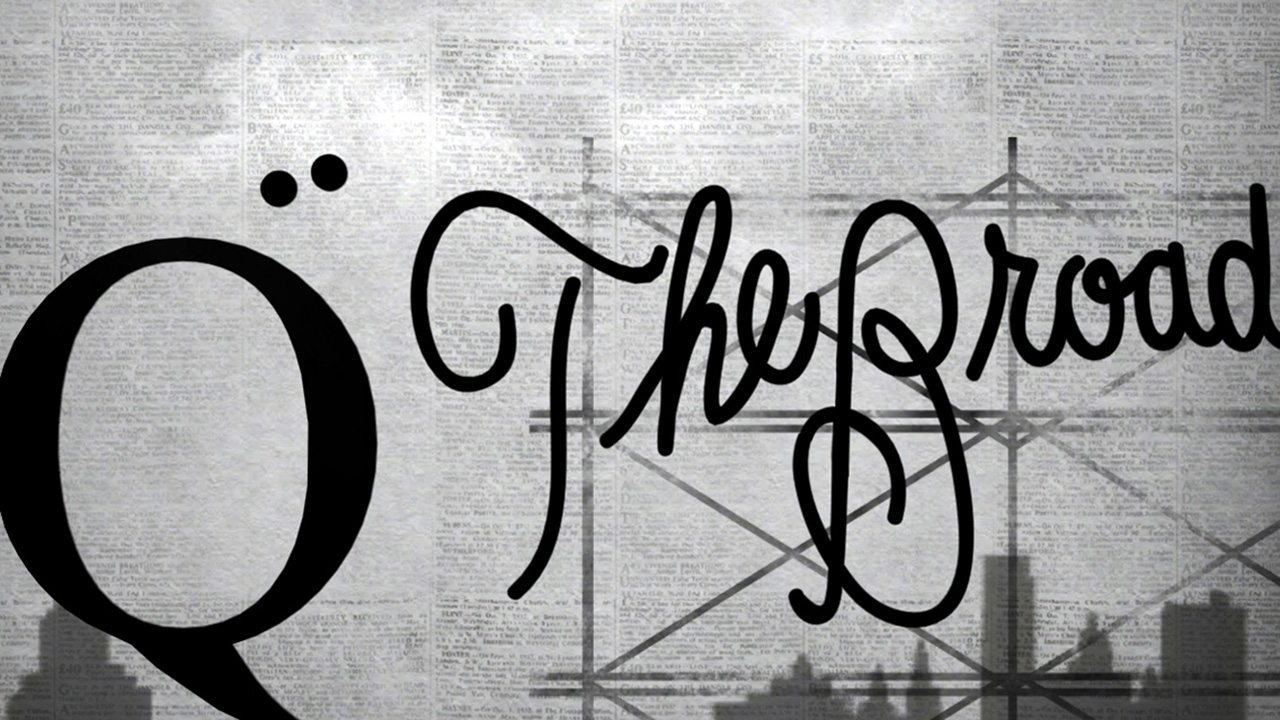
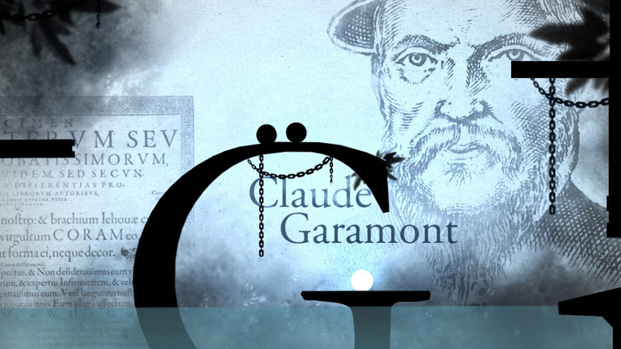
Before I mention anything else, I have to comment on the art and music of this game. Throughout the game, the artwork reflects fonts and the history behind them. The background images add greatly to the atmosphere, and the design in every level of this game looks incredibly authentic and amazing. The soundtrack is fitting to each level, and it perfectly complements the art and gameplay. Without spoiling too much, there is even a humorously designed level towards the end that I feel many would enjoy.
You play as two punctuation marks throughout the game. This seemed like a very unusual choice at first, but after I familiarized myself with the controls, there were moments when I found myself enjoying the two dot mechanic. Finding the last punctuation mark to form an ellipsis was a pretty cool way to end a level. Excluding the tutorial, there are 10 levels total. Each level has different mechanisms and letters that often act as ledges that the player can jump on. The physics in the game are commendable early on. In the level “Garamond,” I was surprised by the detail of a raft I had to jump on. It swayed back and forth depending on where the weight of my dots were. The difficulty of each level increases greatly after the first three, and it becomes imperative for the player to time jumps perfectly. I would also recommend players to be cautious when rolling through a level for the first time. Especially if he or she wants to collect all the letters. In each level you can collect the alphabet and some symbols. The collectible letters can also be used as a gauge on where you are in the level, since you progress through the alphabet as you progress in each stage.
Unfortunately, even with all these positive aspects, the gameplay can still eventually get monotonous and sometime frustrating. The educational element of this game, while informative, is incredibly easy to overlook. I didn’t really ever feel the urge to pause playing or even take time after each level to read the history of any fonts. For being such a central element of the game, the actual content of typography will unfortunately only appeal to a very select few players. While the central themes of typography and font history add to the artistic element of the game and make Type: Rider unique, it also limits gameplay. The simplistic gameplay design elements can be cool, but they never really flourish into something memorable. Even as someone who enjoyed the art style of the game, I eventually grew tired of rolling through a level and timing jumps.
Overall, Type: Rider is a good game. The game can be interesting and fun, and the artwork and music deserves praise. However, as a puzzle platformer, it can be limited by its own subject matter, and the gameplay fails to be something special. That shouldn’t deter people from checking this game out if they haven’t before. I would still recommend anyone interested in typography and cool art design in games to play Type: Rider, since it is beautifully designed and a decent bit of fun. I rate it a 7/10.
Here is the official Type: Rider PS4/PS Vita trailer:
PS4 Review
-
Overall Score - 7/107/10
Over the years, I've lived in Korea, Singapore, Austin, Massachusetts, and San Diego. Through it all I've managed to find a way to make gaming a part of my life. I don't plan on changing that.




More Stories
People of Note Review for PlayStation 5
Drop Duchy – Complete Edition Heading to Nintendo Switch and PlayStation 5 April 21
GDC 2026: The House of Hikmah Review for Steam